Making Sequin Debit Card’s
Perks and Rewards More Accessible
by Providing a Clearer Way to Find Perks and Rewards
Mobile App | Financial Features | UX/UI Design | Design System | Bussiness Constraints

The Project
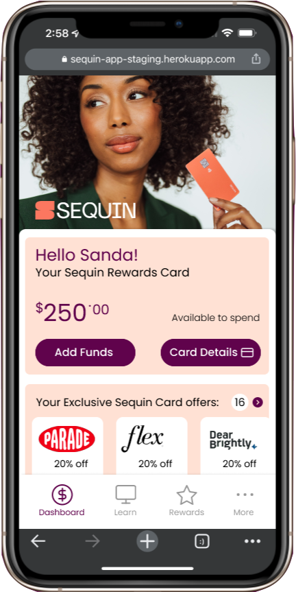
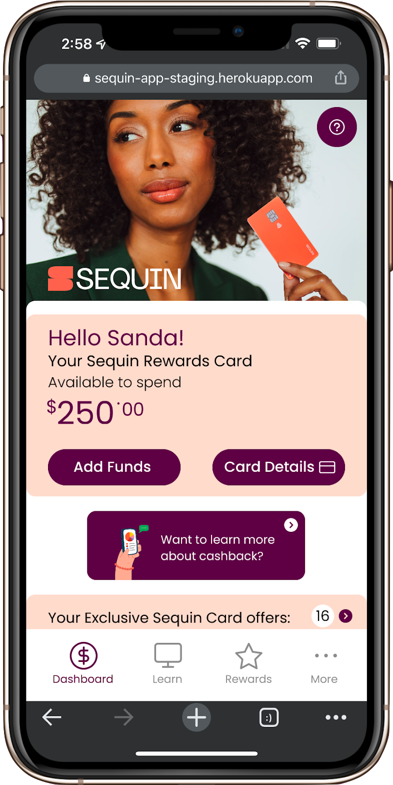
The Sequin Rewards Card is a debit card that has access to unlimited cash rewards and exclusive perks. This project was a contracted team project for web app design and design system.
Role: UI/UX Designer, Information Architet, System Designer
Method: Interviews, Affinity Mapping, Competitive Analysis, Persona Creation, Sketching, Wireframes, Prototyping, Usability Testing
Tools: Figma, Figjam, Google Suite, Photoshop, Zoom
Duration: 3 weeks
Role: UI/UX Designer, Information Architet, System Designer
Method: Interviews, Affinity Mapping, Competitive Analysis, Persona Creation, Sketching, Wireframes, Prototyping, Usability Testing
Tools: Figma, Figjam, Google Suite, Photoshop, Zoom
Duration: 3 weeks
Scope
Sequin seeks to empower women and female-presenting individuals as they start their careers and begin their credit-building journey. They are looking to empower women with information, and their challenge is that there's so much information that they want to present. My team and I decided to work on Information Architecture and design a easier way for users to find perks and rewards.
Goals:
Objectives:
Goals:
- Conduct interviews to see what user expected from using a debit rewards card
- Develop a Web Design System that Sequin Financial can use across different platforms, including desktop computer, tablet, or smartphone.
- Web Design System, consisting of Accessible Colors, Fonts, and Relevant Components, will keep Sequin products consistent between screens and across devices.
- Conduct usability tests for analysis user behaviors
- Design a transparent design benefit both Sequin Financial and their users by increasing engagement and usability of their product
Objectives:
- What informations or functions could be add for users to be more attract to Sequin?
- How could our design be more inclusive for all users?
- How to engage users to learn about financial knowleges in Sequin's web app?
Discovery
Competitive Analysis Insights:
Sequin Mobile vs Desktop websites
Bank of America App
Chase Banking App
Capital One
Credit One
User Interview Insights:
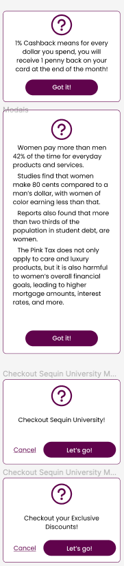
2. Cash Back
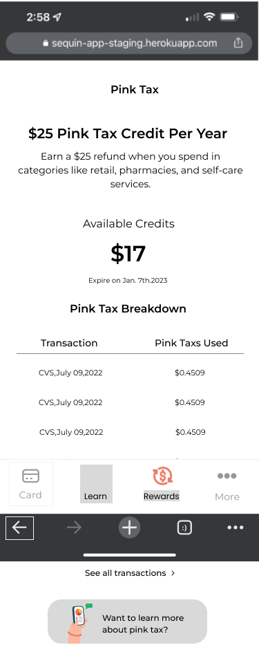
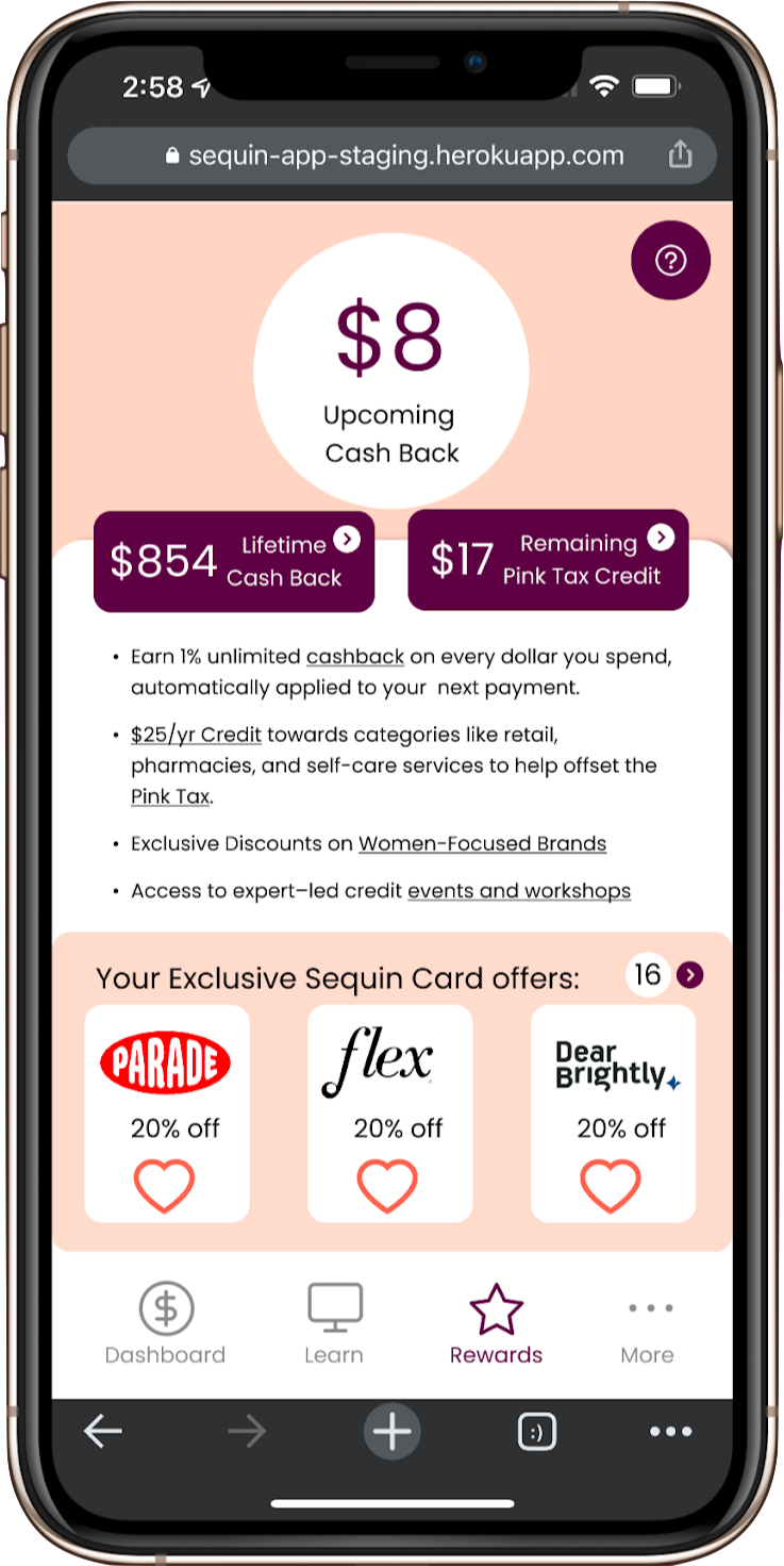
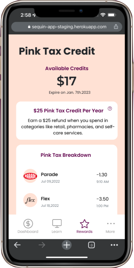
3. Pink Tax Credit
4. Discount Codes
Sequin Mobile vs Desktop websites
- Perks/cash back icons need to match between web and mobile - inconsistencies in usage of icons. (eg. one icon means different things.
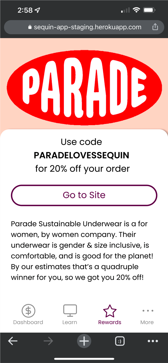
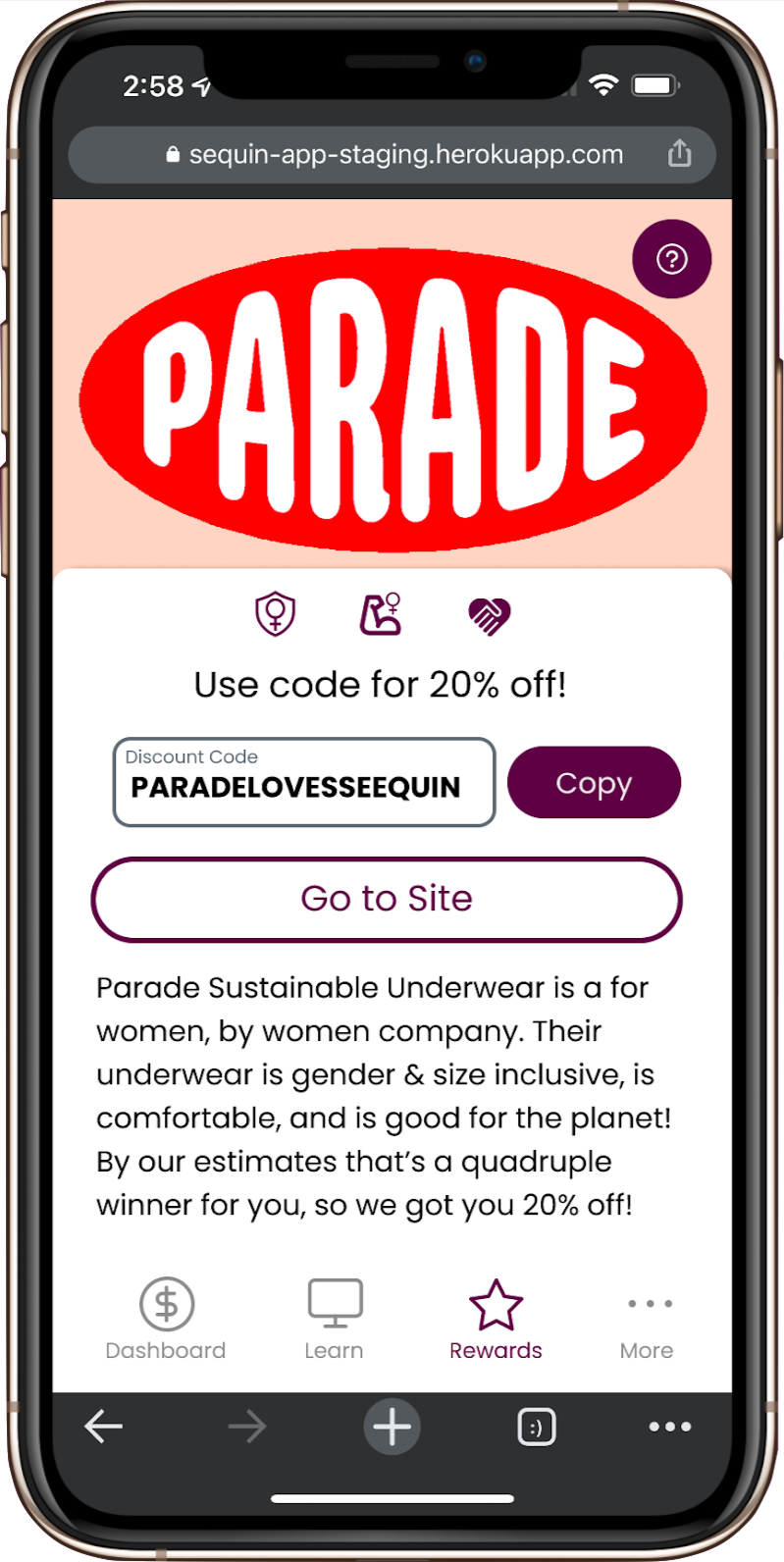
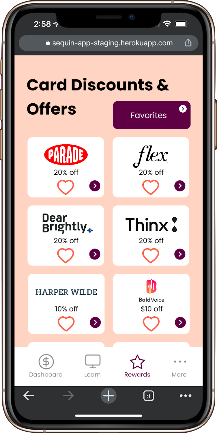
- The way discount codes are currently displayed, there is enough room to just display the discount code without needing to open anything new. Maybe they want to track who is using them
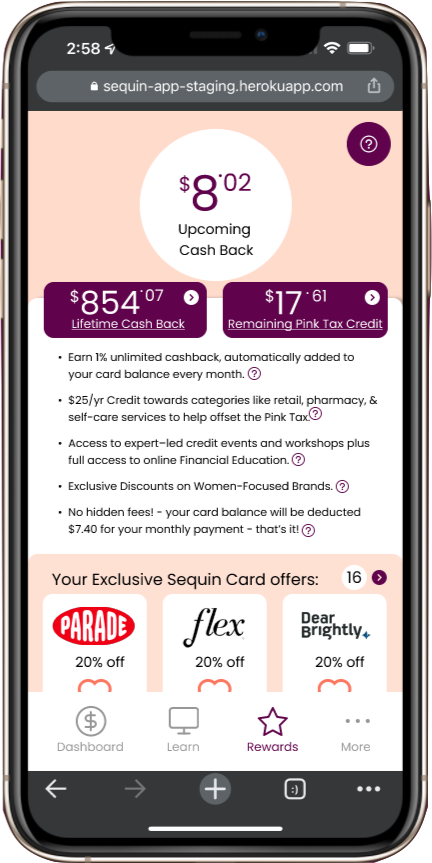
- Need to add pink tax to perks page.
- Dashboard should include top 3-5 perks listed so that there are multiple ways to get to perks.
Bank of America App
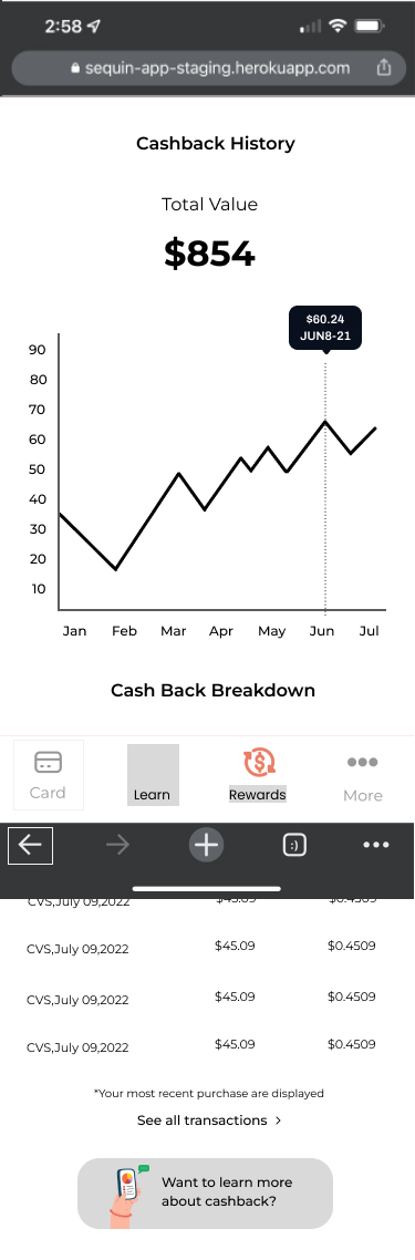
- Bar chart - tells you how much credit you have left.
- Icons & Images make Cash Back Categories more clear
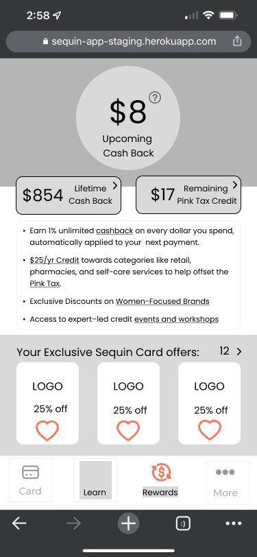
- Perks and Rewards are linked multiple times including on dashboard
- History of perks received links to a separate page.
- Includes both a bottom nav bar as well as a hamburger menu
Chase Banking App
- Suggest a few top perks on the dashboard. (list others with number of additional offers to choose from)
- List current available points/cash rewards (doesn't even list total lifetime numbers)
- Add ? icon for words/ideas that are difficult to define.
- To show lifetime rewards, can have bar chart and breakdown by category what is earning them the most cash back?
- Can "add" offers to card - users can favorite what they want. Might be too dark of a pattern, but does get them invested in their card's benefits.
Capital One
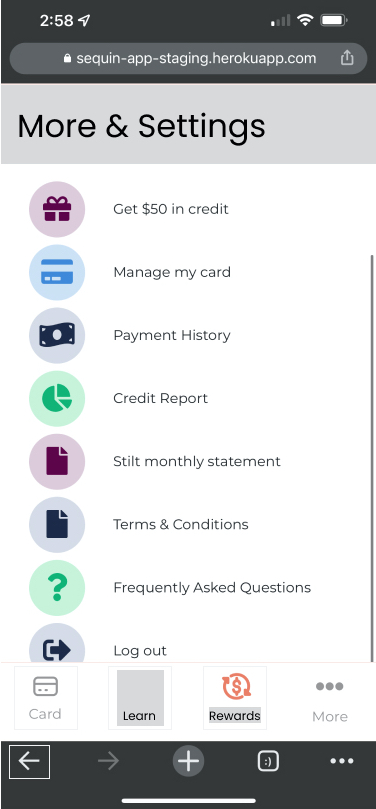
- Utilizes a very small dropdown menu for 3 sections (home, help and profile) but fits the most content in long vertical pages. Hides? rewards to the end of the page.
- Search bar to search within offers and rewards.
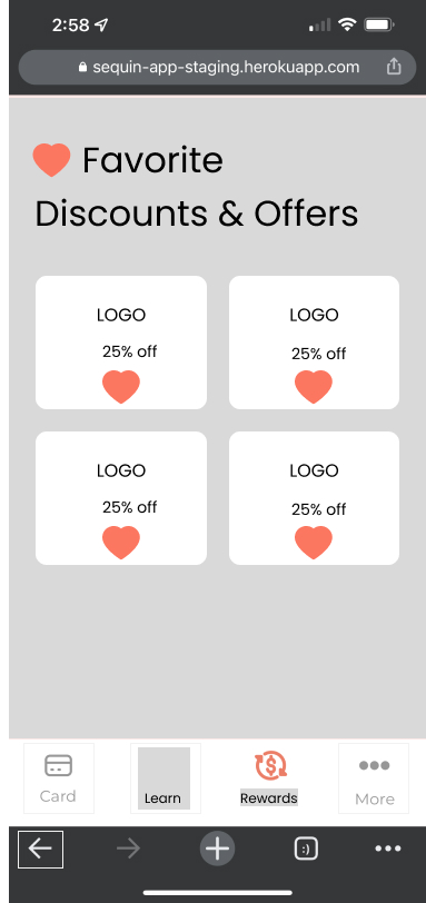
- Rewards are listed with logos (2 per row on mobile with highlighted % discounts and an option to save the offer to their card)
- Mobile web does not include a bottom nav bar, only a dropdown menu.
Credit One
- Balances the usage of the down bar menu with 4 sections (accounts or home - offers / Credit Score / Settings) and content laid out in vertical pages rewards are right after your account info and balance
- "Learn more" tabs prompt users to look at rewards from the dashboard page.
- Discounts include location and distance (eg. 1.2 miles away in store OR online offer) (option to turn on location sharing to see which offers are closest)
- Can sort categories of offers by dropdown menus - City, categories, and search.
User Interview Insights:
- Perks users care about in order of importance
2. Cash Back
3. Pink Tax Credit
4. Discount Codes
- Users are not familiar with debit rewards cards
- Users learn from friends, family, and attempt to learn from social media, but do not have access to financial education
- Women care about elevating other women
- Users have a hard time finding discount codes on their rewards cards
Define
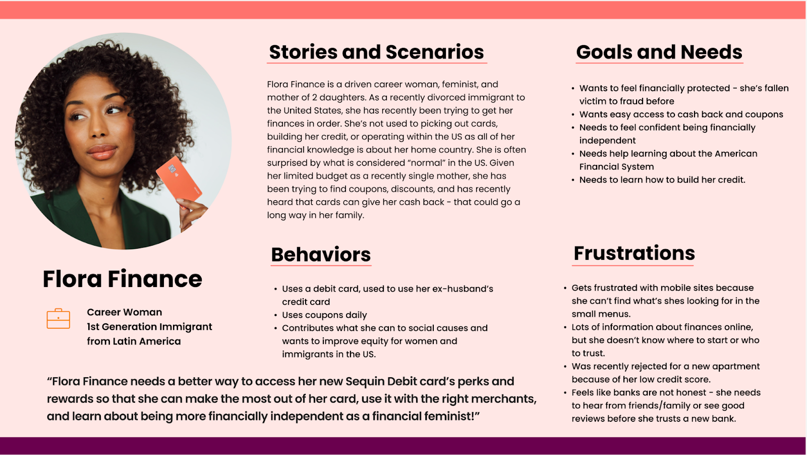
Personas:

Problem Statement:
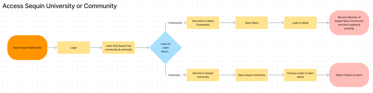
Sanda Sequin needs a better way to access her Sequin Debit card’s perks and rewards so that she can make the most out of her card, use it with the right merchants, and learn about being more financially independent as a financial feminist!
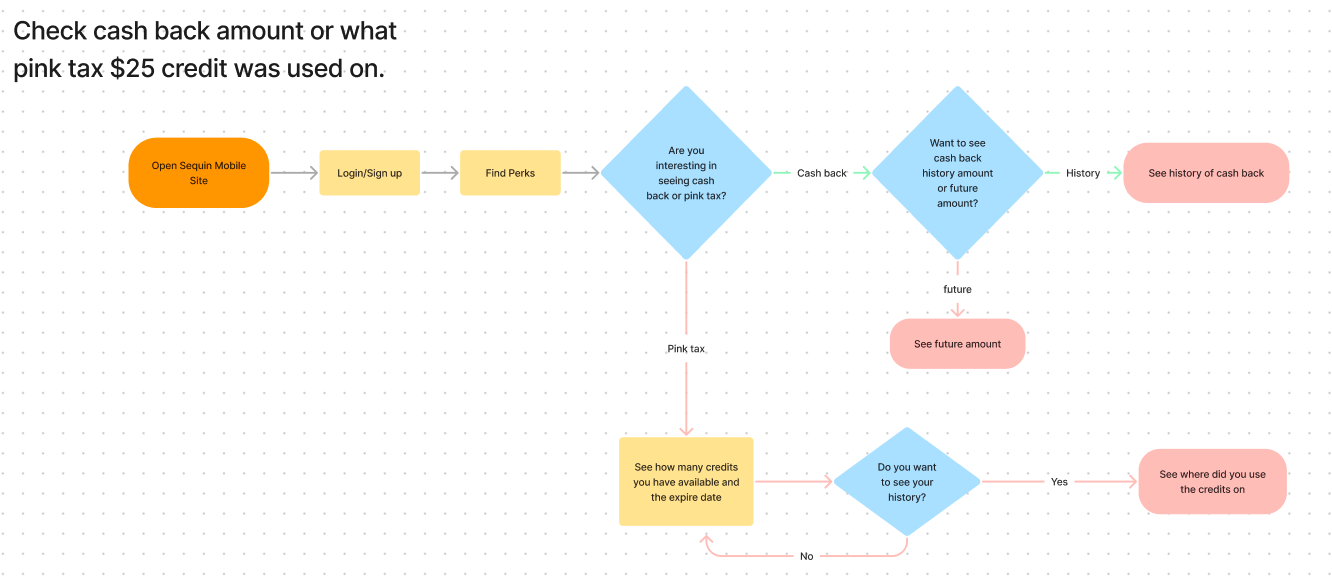
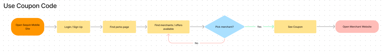
User Flows:
Problem Statement:
Sanda Sequin needs a better way to access her Sequin Debit card’s perks and rewards so that she can make the most out of her card, use it with the right merchants, and learn about being more financially independent as a financial feminist!
User Flows:
Ideate
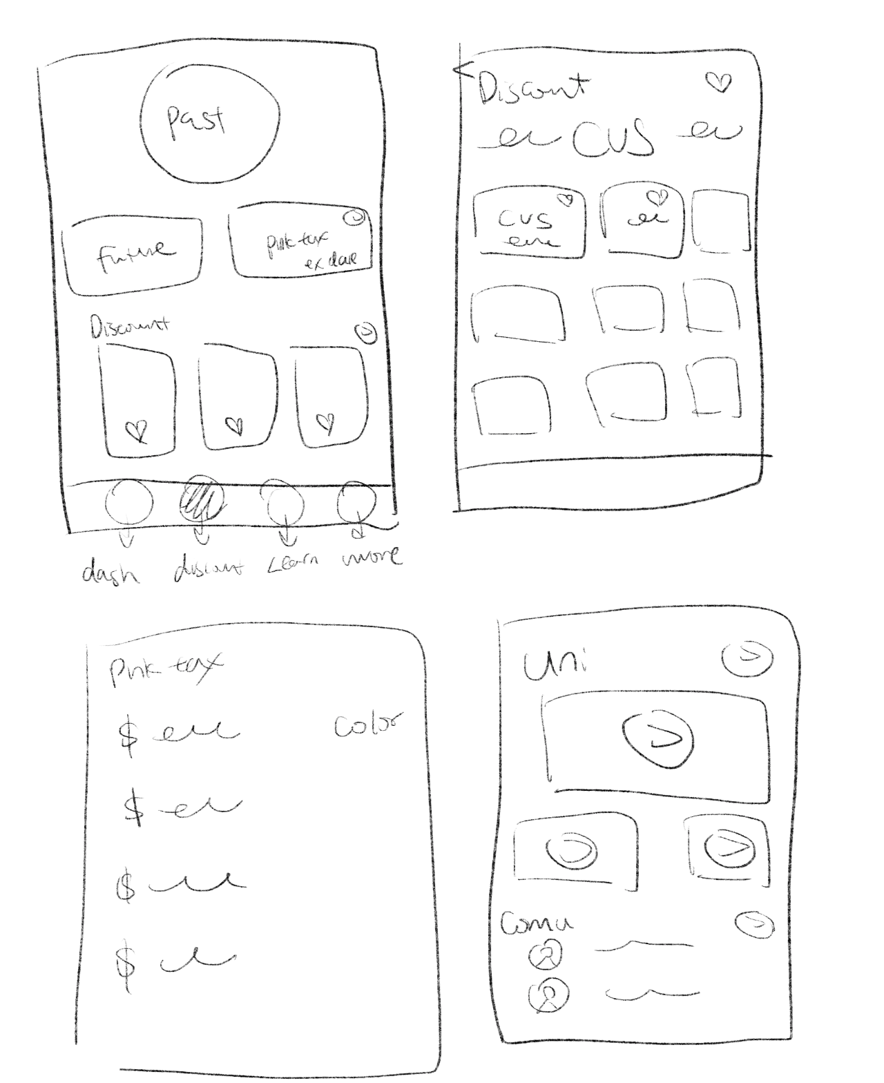
Design Studio
Our team wanted to bring together different perspectives and rapidly generate more innovative solutions. We decided to do a design studio. We had 5 minutes to sketch out many solutions for Sanda Sequin as possible and come back as a team to critique.
![]()
![]()
Mid-fi Wireframes
We gathered our ideas from the design studio and did mid-fi wireframes. After developing mid-fi wireframes we shared another round of our insights.
Insights:
1. Add more details about merchants. A new merchant discount screen to show why Sequin choose specific merchant.
2. Navigation bar needed new icons and names. Users expected different icons for each topic.
Our team wanted to bring together different perspectives and rapidly generate more innovative solutions. We decided to do a design studio. We had 5 minutes to sketch out many solutions for Sanda Sequin as possible and come back as a team to critique.
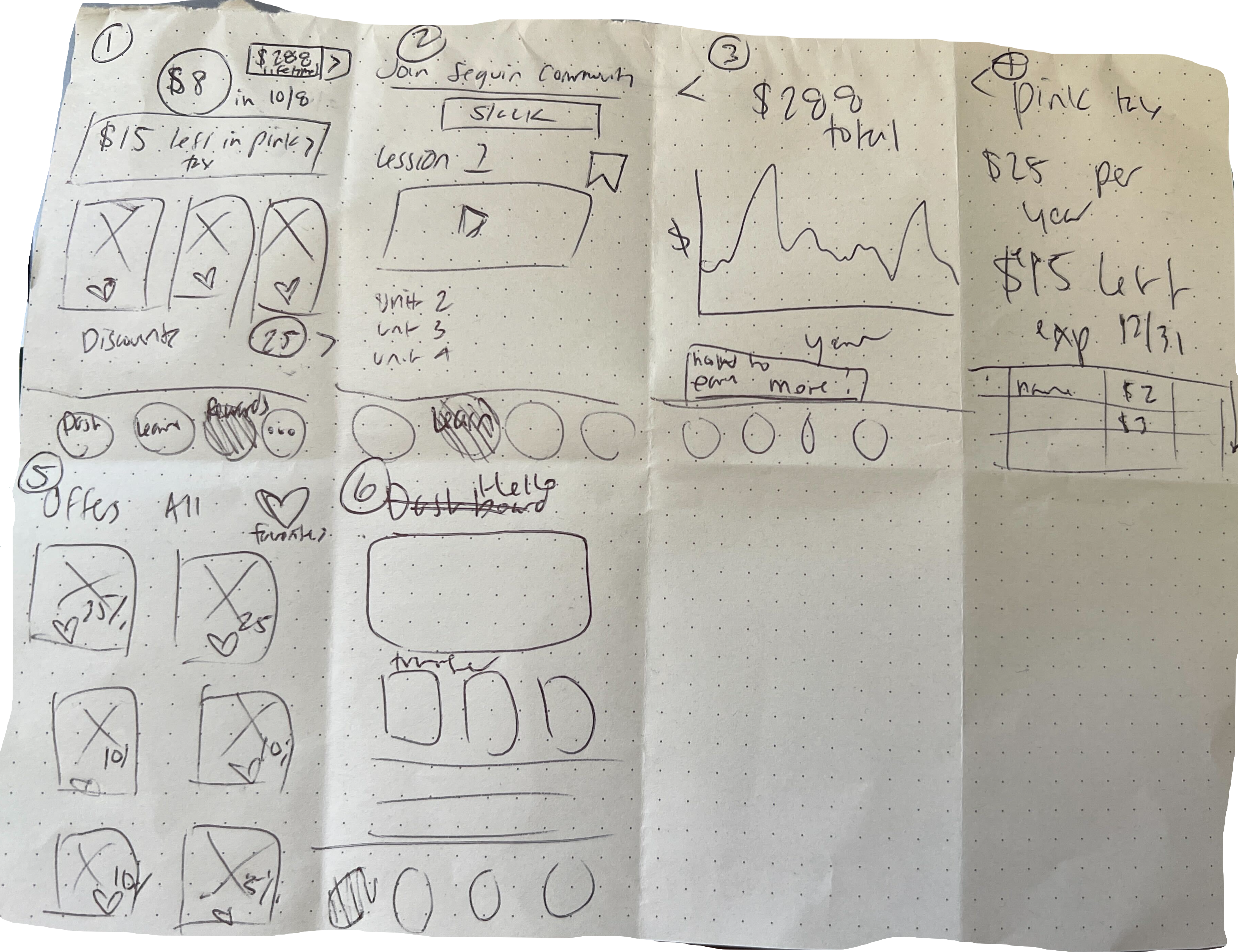
Mid-fi Wireframes
We gathered our ideas from the design studio and did mid-fi wireframes. After developing mid-fi wireframes we shared another round of our insights.
Insights:
1. Add more details about merchants. A new merchant discount screen to show why Sequin choose specific merchant.
2. Navigation bar needed new icons and names. Users expected different icons for each topic.
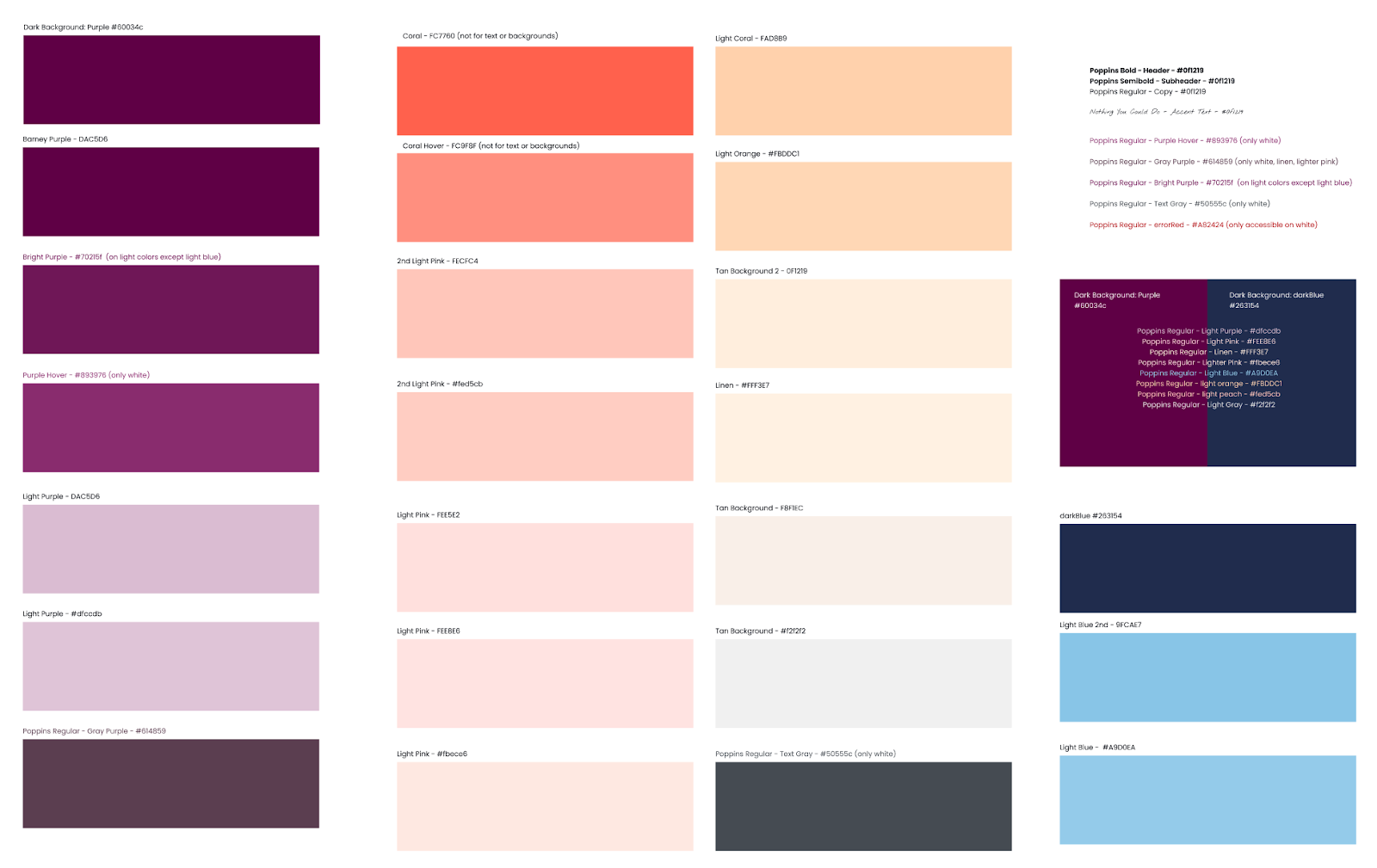
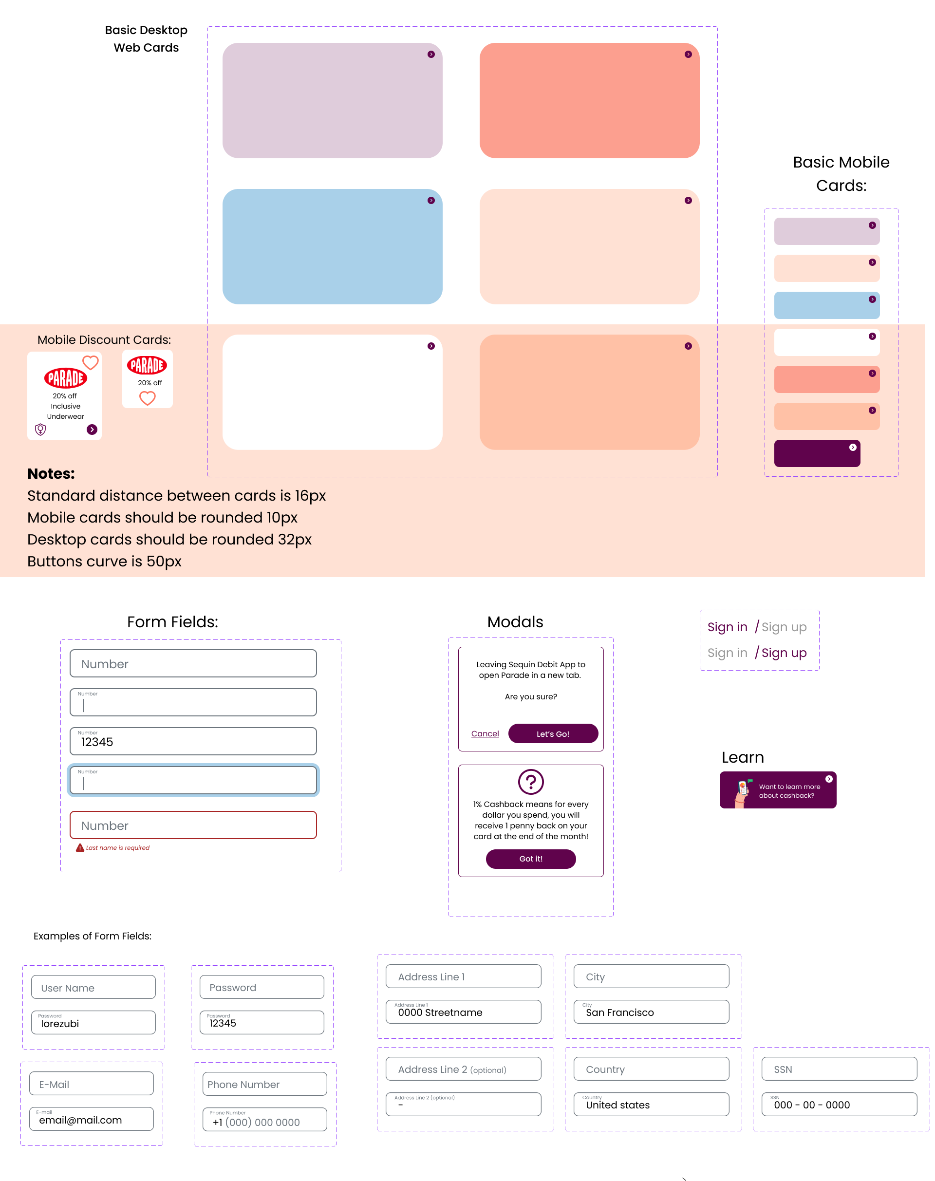
Web Design System
Our team created a design a system of Colors, Fonts, Checkboxes, Radio Buttons, Dropdown Menus, Form Fields, Accordion Menus, Icons, Hover States, and Style Guide to be used consistently across all platforms and communications.
Cataloguing Existing Colors
![]()
Simplified Cohesive Color System
![]()
Buttons&Icons
![]() Cards&Form Fields
Cards&Form Fields
![]()
Cataloguing Existing Colors
Simplified Cohesive Color System

Buttons&Icons
Hi-Fi Mockup
Based on the design system and mid-fidelity wireframes, we did high-fidelity prototype
![]()
![]()
![]()
![]()
![]()

Usability Testing
We conducted a total of 6 usability tests using the high-fidelity prototype.
Insight 1:
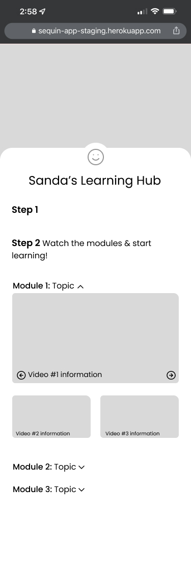
4/6 Users were able to open the Learn tab and understood what it meant at first glance.
![]()
![]()
Insight 2:
![]() 5/6 Users were able to use a discount code with less than 1 moment of confusion.
5/6 Users were able to use a discount code with less than 1 moment of confusion.
![]()
![]()
![]()
Insight 3:
1) 5/6 users were able to determine what their cash back means and will be able to explain correctly how to increase their cash back payments.
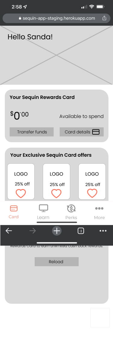
2) 1 user noted that she assumed she would get fined for overdraft fees.
![]()
![]()
![]()
![]() Insight 4:
Insight 4:
0/6 Users were familiar with the merchants on the discount page.
![]()
![]()
Insight 1:
4/6 Users were able to open the Learn tab and understood what it meant at first glance.

Insight 2:
Insight 3:
1) 5/6 users were able to determine what their cash back means and will be able to explain correctly how to increase their cash back payments.
2) 1 user noted that she assumed she would get fined for overdraft fees.
0/6 Users were familiar with the merchants on the discount page.

Next steps
Our team recommand next steps for Sequin
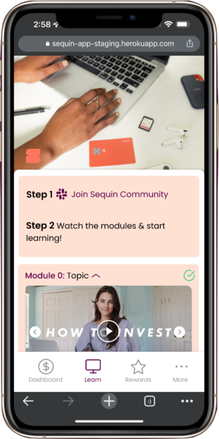
- Sequin University: 100% of users that participated in the usability test believe that Sequin University and Financial Education is the primary benefit of the Sequin Debit Rewards Card. We recommend improving this system to be optimized for mobile to increase usage. Chunk topics into 2-6 minute videos or readings that users can watch/read chronologically followed by 1-4 question mini quizzes to boost engagement & understanding. (See UI Patterns in Noom and other online education technology.)
- App: Through competitive and comparative analysis, we found the bottom navigation bar is standard convention for installed apps. Additionally 90% of users prefer apps for banking services, therefore we recommend creating a Sequin App for mobile banking.
- When this happens include a back button on necessary pages.
- You may also opt to move “More and settings” to a hamburger menu and put “Credit Reports” in its place in the bottom menu.
- Credit Building Product: We found 100% of users were concerned about their credit score and needed products that build credit. We recommend adding a credit building tool (eg. credit line, credit rewards card option, etc.)
- Web Design System: Continue to tweak the web design system to fit changing needs. (eg. Come up with standard font sizes, identify additional icon/button needs, etc). As long as the documentation is continually updated, it should stay cohesive through company growth.
- Purple Question Mark on each screen: In the future this button should link to the FAQ page (as on the desktop page) and a contact us form should be placed on this screen.